Concept ProjectConceptFictional brand

Fashion retail / Ecommerce

Veloura

Quiet statements. Strong silhouettes.

An editorial fashion-store concept where strong campaign art, controlled typography, collection browsing, and product detail create a more aspirational shopping experience.

Premium ecommerce storefront and product-detail experience

Design preview
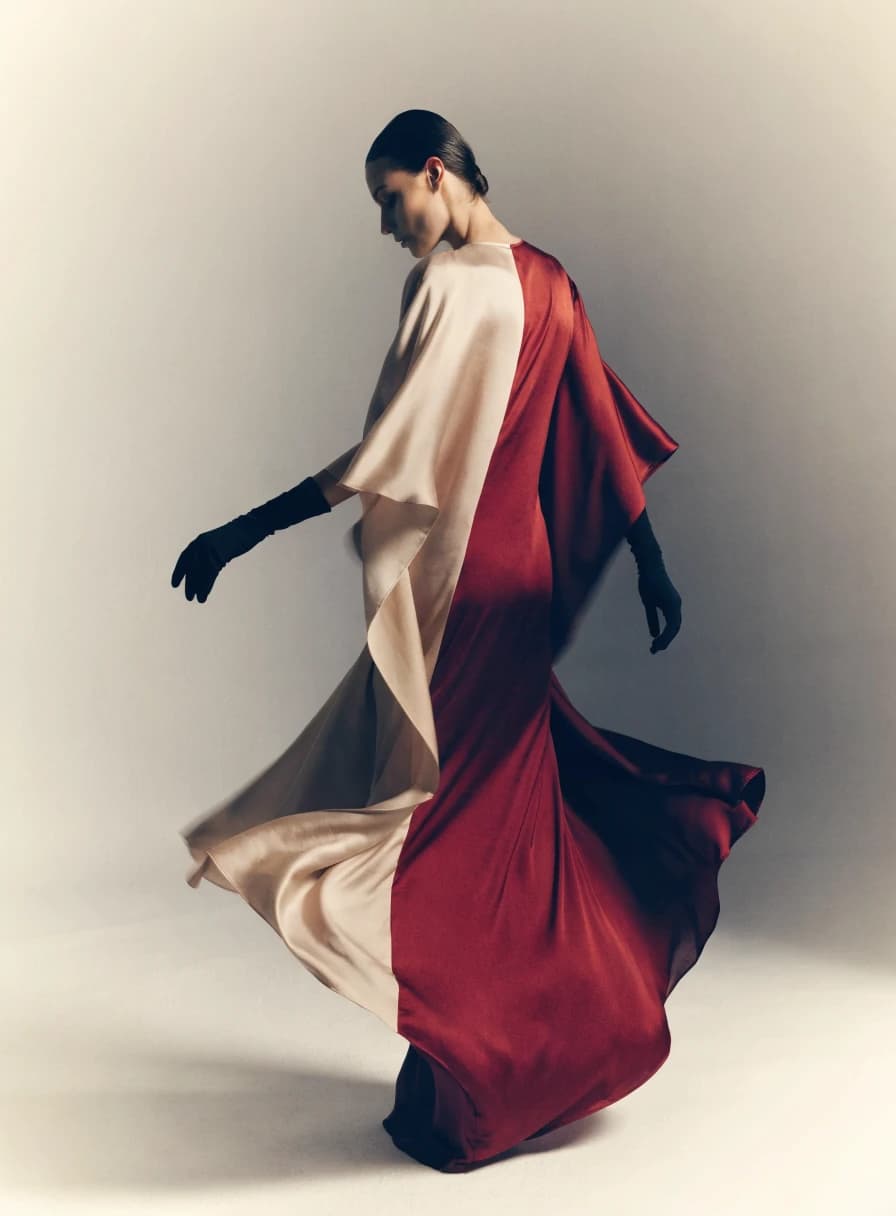
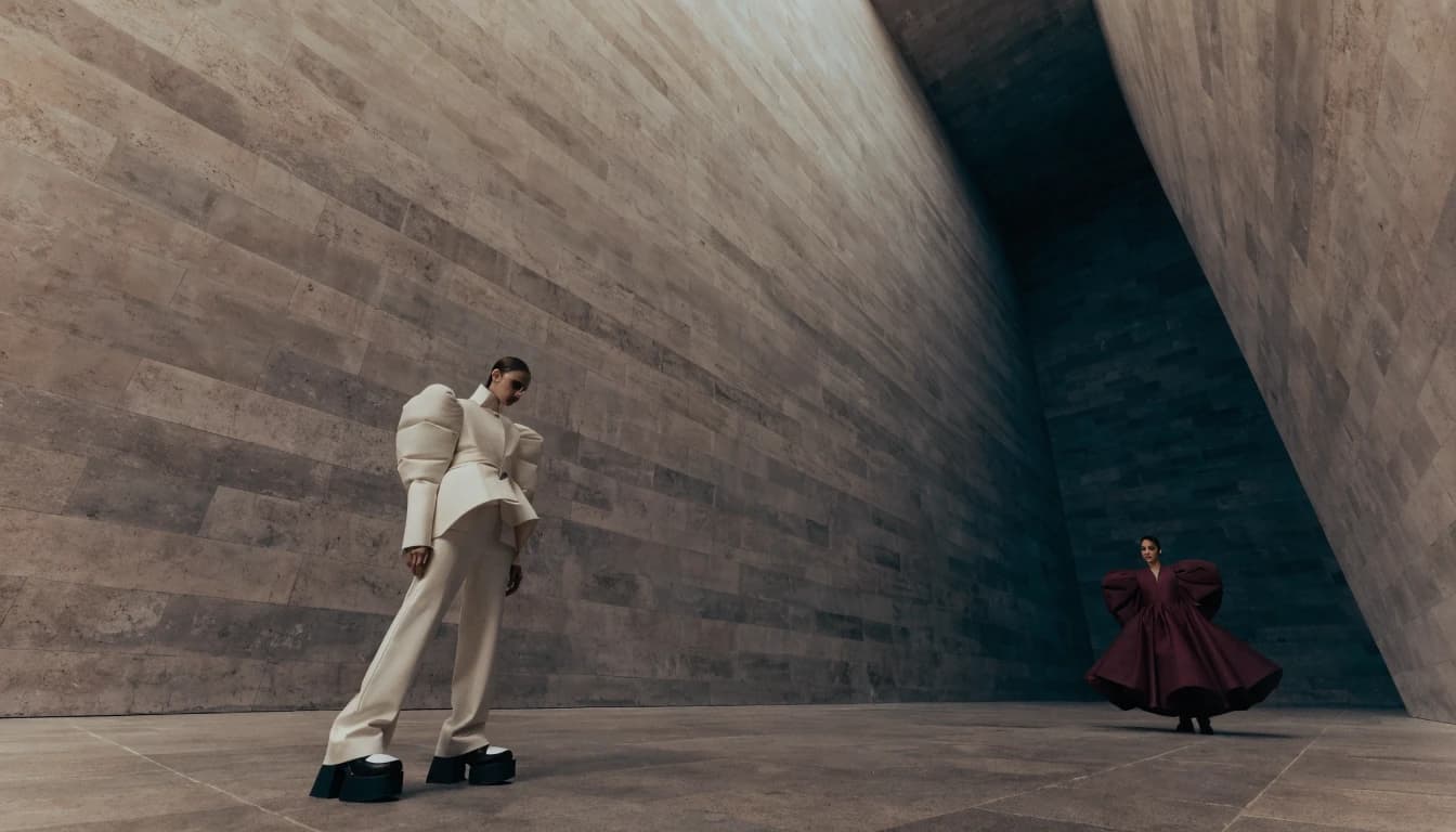
Editorial fashion campaign for the fictional Veloura ecommerce concept

Project overview

What this project is.

Veloura is a premium retail concept that explores how an ecommerce website can feel editorial while still helping shoppers browse collections, compare products, select variants, and move toward a cart.

The project is designed around aspiration and clarity. It shows how campaign imagery, product cards, collection filters, product-detail information, and a demo cart can work together without reducing the brand to a generic catalog.

Public accessInteractive public preview available

StatusConcept project with a public interactive preview. It is not a live ecommerce store and does not accept payments or orders.
Problem or opportunity

Why this direction exists.

Fashion ecommerce has to create desire and support practical buying decisions at the same time. The opportunity is to give products enough space to feel premium while keeping size, color, collection, and cart interactions easy.

Product strategy

The product decisions behind the interface.

Campaign first, product ready

The homepage uses editorial storytelling to create interest, then the shop and product pages support precise decisions.

Collections over clutter

The concept organizes browsing around collections and lookbook context instead of overwhelming visitors with raw product density.

Demo cart honesty

Cart and checkout intent are presented as storefront interactions, not a real purchase flow.

Core features

What the project demonstrates in practice.

Collection browsing

Shows how category and collection pages can balance product density with brand atmosphere.

Product detail flow

Demonstrates variant selection, sizing context, imagery, and related pieces.

Lookbook storytelling

Connects campaign imagery to shoppable product context.

Demo cart drawer

Illustrates shopping intent without routing visitors to a fake checkout.

User roles and permissions

Different users need different access.

Shopper

Browses campaign content, filters products, selects variants, opens quick view, and adds sample items to a demo cart.

Store team

Would manage products, collection launches, campaign imagery, and inventory data in a production system.

Workflow

The journey the system is designed around.

Step 01

Visitor enters through a campaign

The storefront establishes the collection world before asking the visitor to browse products.

Step 02

Collection browsing narrows interest

Filters and product cards help shoppers move from inspiration to specific items.

Step 03

Product details resolve hesitation

Variant, size, imagery, and description patterns support the purchase decision.

Step 04

Cart intent stays clearly fictional

The preview shows cart behavior but does not process payments or pretend to sell products.

Design decisions

How the experience is shaped.

Visual direction

Warm bone, oxblood, black, and restrained chrome frame the collection like an editorial publication rather than a crowded product catalog.

Typography

A high-contrast editorial serif with neutral sans utility labels and spacious product typography.

Logo direction

A custom-spaced wordmark and minimal woven-label V monogram anchor the identity.

Image direction

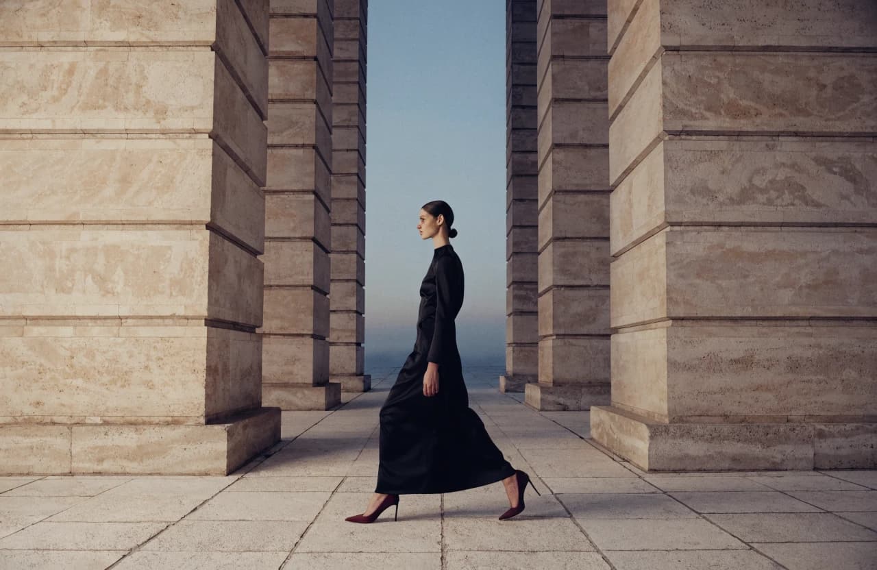
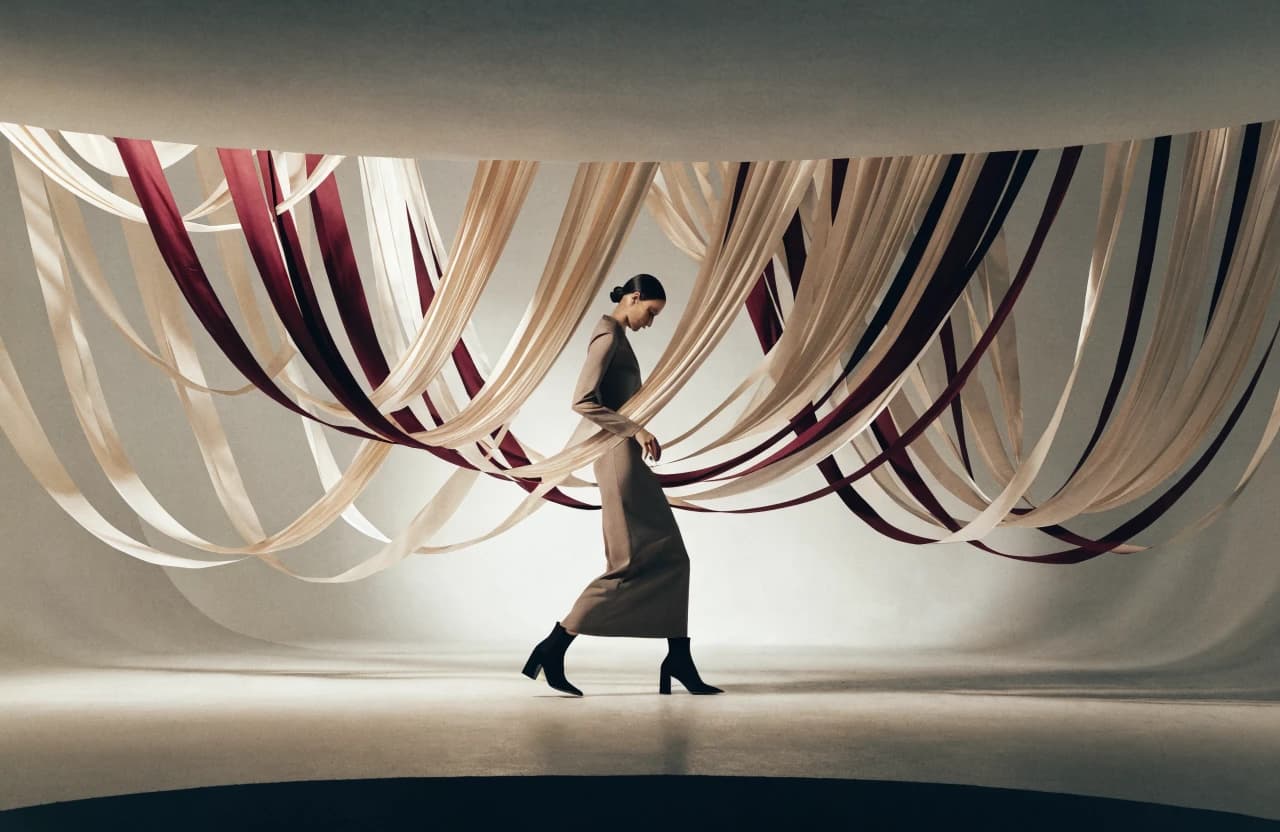
Full-body campaign frames, studio product close-ups, fabric texture, and magazine-like lookbook pacing.

Motion

Soft image masks, hover swaps, cart-drawer motion, and restrained lookbook parallax.

Interface choices

Editorial pacing

The layout alternates large campaign moments with product grids so the brand feels premium and usable.

Quiet utility

Sizing, color, cart, and collection controls are restrained so they support the product instead of overpowering it.

Mobile product focus

The mobile experience prioritizes imagery, variants, and quick browsing because ecommerce decisions often happen in narrow viewports.

Responsive preview

The idea survives every screen.

The composition changes with the device instead of shrinking a desktop page until the text becomes unreadable.

Responsive design study

Campaign storefront

Autumn study · fictional collection

Quiet statements.
Strong silhouettes.

An editorial storefront concept designed around product, proportion, and slower visual discovery.

Editorial fashion campaign with sculptural ivory and burgundy silhouettesCampaign 01

New arrivals

The first edit.

Contour Coat$240

Outerwear

Column Dress$168

Dresses

Soft Form Knit$118

Knitwear

Arc Trouser$142

Tailoring

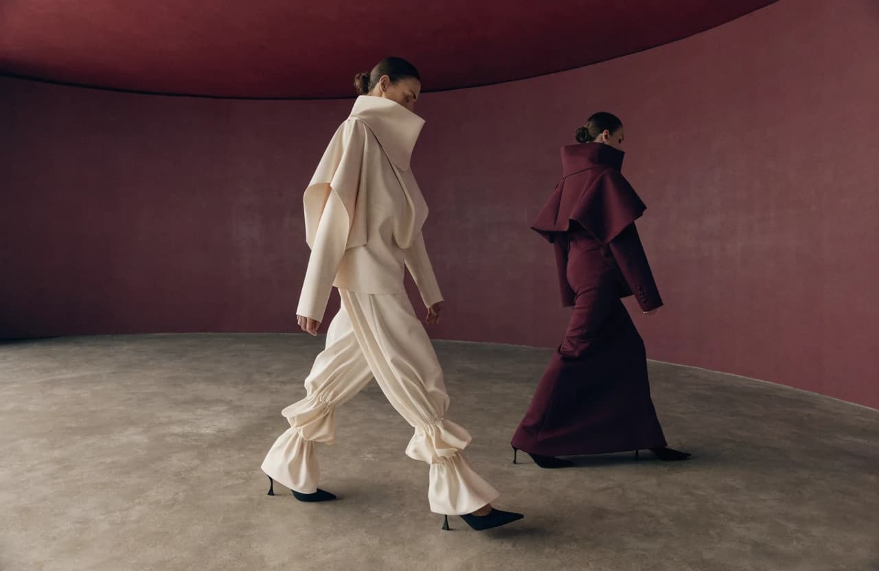
Fashion collection photographed in a deep burgundy room

Collection 02

Structure after sunset.

Tailoring, long lines, and deep oxblood color connect campaign storytelling to a focused product edit.

Browse by category

A compact wardrobe, clearly organized.

Campaign story

Clothes shown in rhythm, not just rows.

Editorial pacing gives the collection emotional context before the interface returns to practical product details.

Fictional campaign direction. No model, designer, photographer, or production credit is implied.

Shop the story

Product information stays calm and complete.

Quiet Blazer$210

Tailoring

Folded Skirt$126

Dresses

Longline Vest$154

Outerwear

Ribbed Shell$84

Knitwear

Lookbook 01

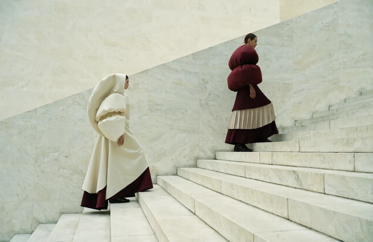
Studies in shape and restraint.

A dedicated editorial space creates a reason to browse beyond category pages.

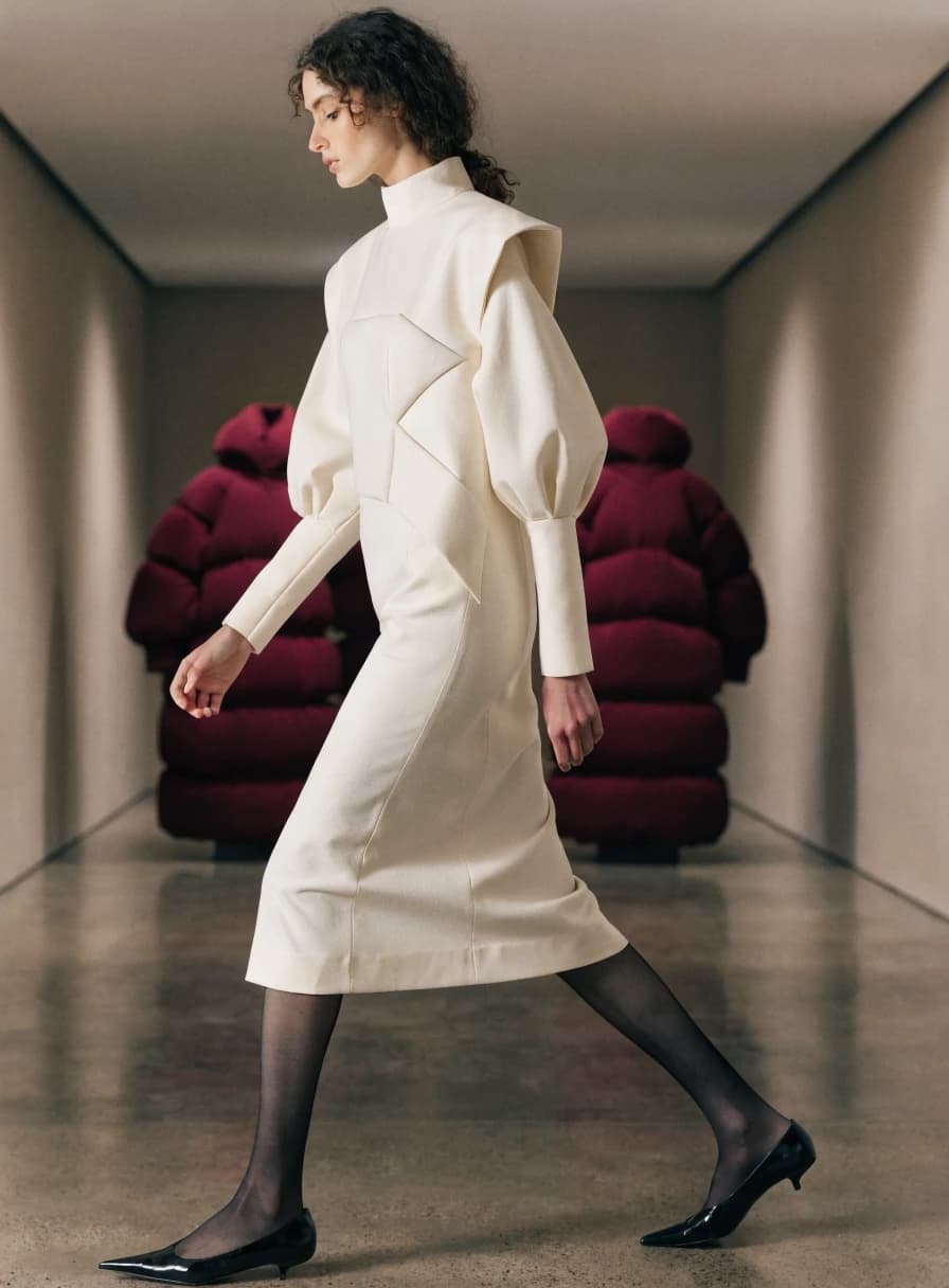
Fashion look in a long gallery corridor

Material philosophy

Explain what the garment is made to do.

The concept gives fit, composition, care, and sourcing context a clear hierarchy without inventing certifications.

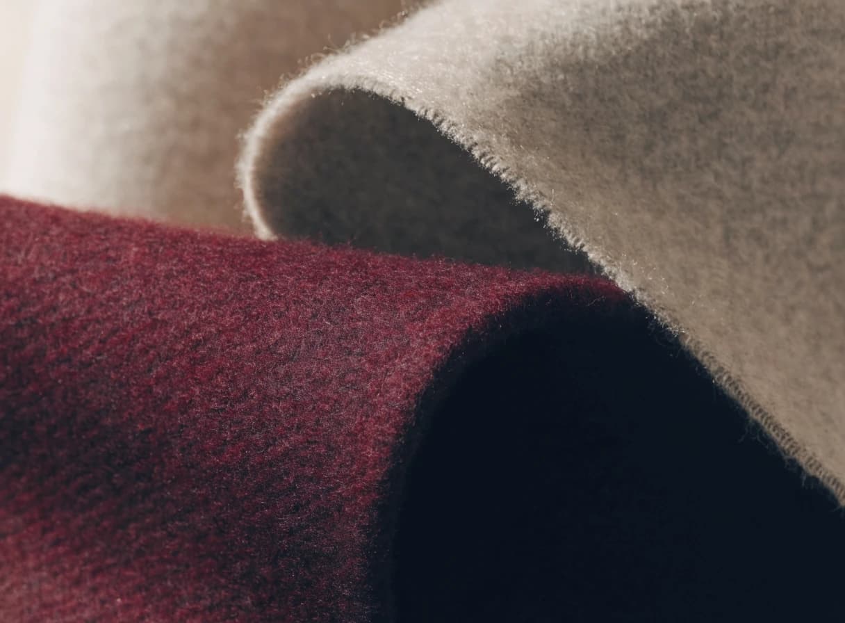
Close view of burgundy wool fabric
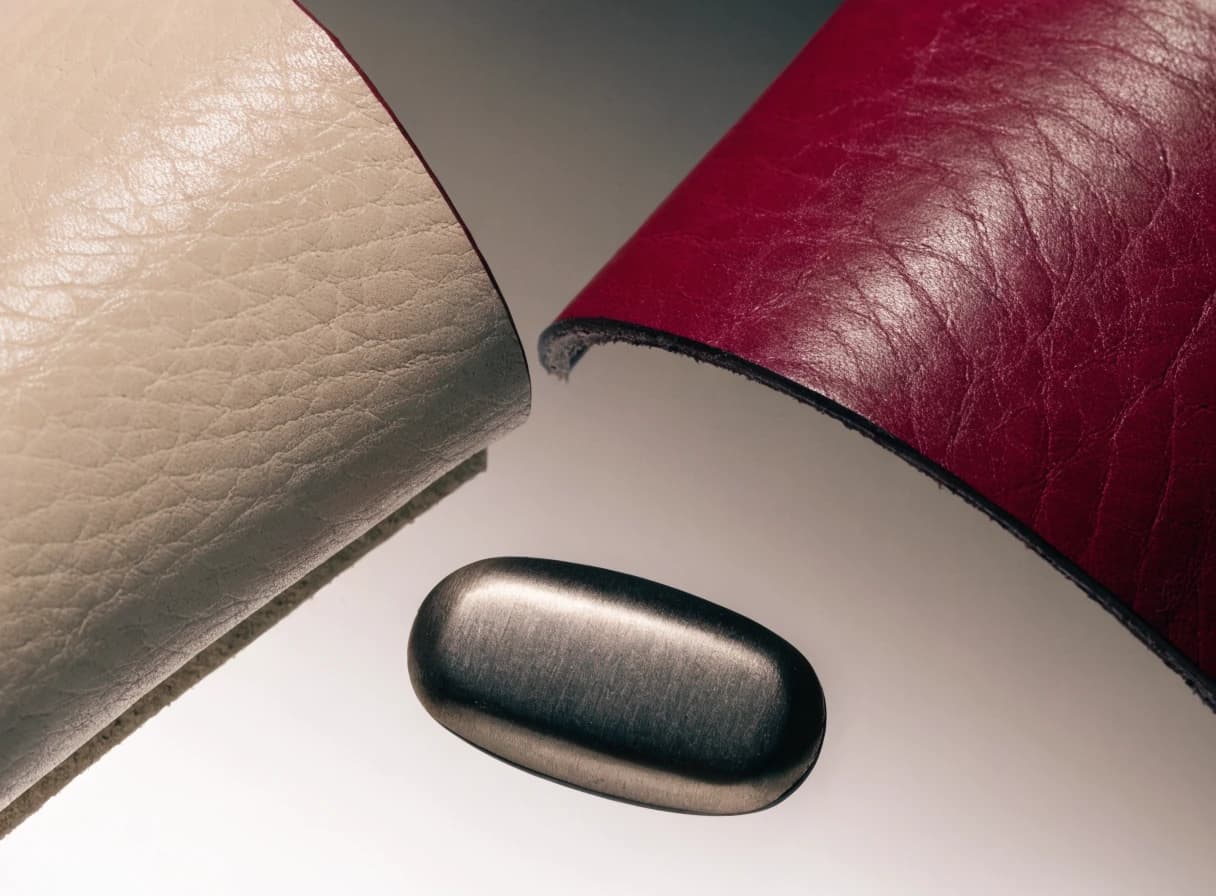
Close view of cream leather texture
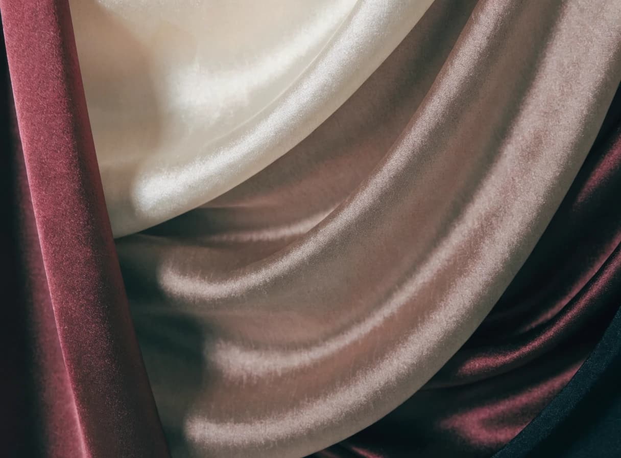
Close view of softly folded taupe silk

Editorial notes

New collections, slowly introduced.

Demo newsletter interface. No mailing list is connected.

Key pages and screens

Every page has a job.

This is the strategic page system behind the visual direction, not a pile of decorative screens.

Screen 0101

Home

Introduces the campaign, new arrivals, and featured collection.

Why it matters

A strong storefront establishes the emotional reason to browse before presenting the full catalog.

Screen 0202

Collection

Balances product density with filters, imagery, and category context.

Why it matters

Shoppers need enough comparison without reducing the brand to a commodity grid.

Screen 0303

Product Detail

Shows photography, variants, sizing, description, and related pieces.

Why it matters

Clear product decisions reduce hesitation while editorial details preserve perceived value.

Screen 0404

New Arrivals

Gives frequent visitors a focused view of the latest release.

Why it matters

A dedicated entry point makes repeat discovery fast and campaign launches easier to promote.

Screen 0505

Lookbook

Connects campaign imagery to shoppable products.

Why it matters

Editorial storytelling helps customers imagine complete looks rather than isolated items.

Screen 0606

Cart Preview

Summarizes variants, quantity, and purchase readiness.

Why it matters

A calm cart keeps momentum without interrupting continued browsing.

Technical architecture

Technology choices with a purpose.

Frontend

Conceptual
Next.jsReactResponsive storefront UI

The preview focuses on product and collection interface patterns.

Commerce model

Conceptual
ProductsCollectionsVariantsCart drawer

All products, prices, and availability are fictional.

Future commerce backend

Planned
InventoryCheckoutPaymentsOrder emails

A production store would require a verified commerce provider and secure checkout flow.

Challenges and solutions

The execution problems this work explores.

Aspirational but usable

The concept keeps editorial imagery strong while preserving product actions and browsing paths.

Product decision clarity

It demonstrates how variants, sizing, and related products can support buying intent without clutter.

Business goals solved

Build an aspirational brand world

Improve product discovery

Make variants and sizing clear

Connect campaigns to products

What the project demonstrates

Premium retail websites cannot behave like generic catalogs. The concept uses editorial pacing to create desire, then switches to precise product information when the shopper is ready to decide.

Veloura is a fictional fashion brand and ecommerce concept. Products, prices, availability, and campaigns are design-preview content only.

Current status and next steps

What is complete, private, or still planned.

Concept

Concept project with a public interactive preview. It is not a live ecommerce store and does not accept payments or orders.
Interactive public preview available

Next steps

Replace fictional products with real catalog data

Choose and integrate a commerce backend if checkout is required

Add real campaign assets, policies, fulfillment content, and product operations

Keep exploring

Related projects