Concept ProjectPrototypeFictional brand

CRM software / Dashboard

OrbitFlow

Keep every relationship moving.

A crisp product site and responsive CRM dashboard concept that makes pipeline health, team tasks, reminders, and customer activity easy to understand.

SaaS product design and responsive dashboard UX

Design preview
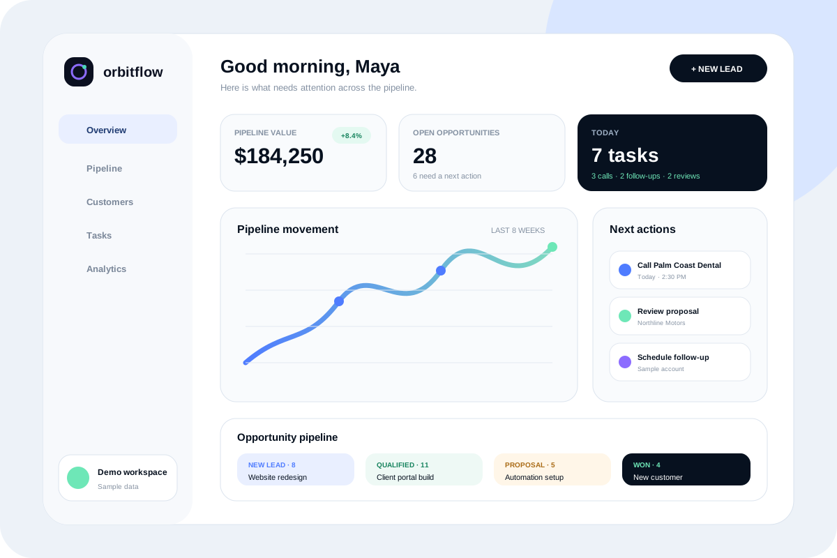
OrbitFlow fictional CRM dashboard concept with pipeline, analytics, and team tasks

Project overview

What this project is.

OrbitFlow is a SaaS product concept that combines a public product website with a CRM-style dashboard. It demonstrates how a software product can explain itself to buyers and then support real work through dense but readable operational screens.

The project is designed around pipeline visibility, customer context, tasks, automations, and analytics. It is a product-thinking exercise as much as a visual one: the marketing promise and the dashboard workflow need to feel like the same system.

Public accessInteractive public preview available

StatusPrototype concept with a public interactive preview. It is not a live CRM product and does not contain real customers, usage data, or operating metrics.


Problem or opportunity

Why this direction exists.

Many business tools either sell clearly but feel weak after login, or have functional dashboards that are hard to explain publicly. OrbitFlow explores how the public product story and the private application experience can reinforce each other.

Product strategy

The product decisions behind the interface.

Connect marketing to workflow

The product site introduces pipeline clarity, while the dashboard shows what that promise looks like in daily use.

Prioritize attention over decoration

Dashboard hierarchy is built around what needs action: pipeline risk, overdue tasks, customer activity, and workflow health.

Keep sample data honest

Numbers in the interface are treated as sample data for hierarchy, not proof of real business results.

Core features

What the project demonstrates in practice.

Pipeline overview

Shows opportunity stages, stalled deals, ownership, and next actions in a compact workspace.

Customer profile drawer

Keeps account context near the work so users do not lose place while reviewing details.

Task queue

Turns reminders and follow-up work into a visible operating rhythm.

Analytics view

Demonstrates how source, velocity, and activity patterns can be presented without overwhelming the user.

User roles and permissions

Different users need different access.

Platform administrator

Would configure teams, notification settings, access, and workflow preferences in a production product.

Manager

Reviews pipeline health, team activity, stalled records, and performance patterns.

Team member

Works through leads, tasks, reminders, notes, and customer follow-up.

Workflow

The journey the system is designed around.

Step 01

A lead enters the system

The interface gives the record a stage, source, owner, and next action.

Step 02

The team works the pipeline

Cards, filters, and detail panels help users move between overview and individual customer context.

Step 03

Tasks prevent missed follow-up

Reminders and queue states make operational work visible instead of relying on memory.

Step 04

Analytics inform refinement

Reports help the team see patterns in sources, conversion movement, and response habits.

Design decisions

How the experience is shaped.

Visual direction

Porcelain surfaces, deep navy type, precise spacing, muted mint signals, and fine data visualization create an app that feels calm under operational pressure.

Typography

A refined modern sans with tabular numerals and compact technical labels for product density.

Logo direction

A geometric orbit path connects a central relationship node to an abstract O and F.

Image direction

Product-led interface composition with focused diagrams instead of decorative stock photography.

Motion

Fast panel transitions, pipeline movement, connection-line drawing, and subtle chart entrances.

Interface choices

Quiet density

The interface uses compact panels and tabular values without making the page feel heavy or unreadable.

Stable navigation

Dashboard sections use predictable navigation so users can move through operational areas repeatedly.

Status language over visual noise

Colors are reserved for state and priority instead of being used as decoration.

Responsive preview

The idea survives every screen.

The composition changes with the device instead of shrinking a desktop page until the text becomes unreadable.

Responsive design study

Pipeline overview

Sample CRM product concept

Keep every relationship moving.

Pipeline, tasks, follow-up, and customer context in one calm operating view.

OrbitFlow CRM dashboard interface conceptDemo workspace

Pipeline

$128k

Open leads

42

Tasks

18

Designed around the teams doing the work

Service teamsSales teamsAccount teamsOperations

Core product

The next action stays attached to the customer context.

Each feature is presented as part of a working relationship rather than an isolated tool.

Shared pipeline

Ownership, stage, value, and next action stay visible.

Follow-up queue

Tasks are grouped by urgency and relationship context.

Customer timeline

Notes, meetings, messages, and changes read as one history.

Pipeline workflow

Progress is a sequence, not a spreadsheet status.

01

New inquiry

A clear owner, next action, and expected movement.

02

Qualified

A clear owner, next action, and expected movement.

03

Proposal

A clear owner, next action, and expected movement.

04

Active customer

A clear owner, next action, and expected movement.

Abstract workflow handoff between automation and a team member

Automation handles the handoff. People handle the relationship.

Assignment, reminders, and stage checks are visible and editable instead of hidden in a black box.

Editorial portrait representing a complete customer relationship view

One timeline for the whole account.

Calls, notes, tasks, and pipeline changes share the same chronology so context survives handoffs.

Reporting

Show where work is stuck, not just what happened.

Sample charts focus on pipeline health, task completion, and follow-up timing. Values are illustrative demo data.

Sample activity by week

Connections

Fit the workflow around the tools already in use.

Constellation of connected product integrations
Email
Calendar
Forms
Accounting
Support inbox
Data exports
Webhooks
Identity

Plan preview

Start with the workflow you can support.

Illustrative tiers demonstrate pricing-page hierarchy, not a live commercial offer.

Sample plan

Core

A representative combination of pipeline, tasks, reporting, and workflow controls.

Sample plan

Team

A representative combination of pipeline, tasks, reporting, and workflow controls.

Sample plan

Operations

A representative combination of pipeline, tasks, reporting, and workflow controls.

Product demo

See how the pipeline, tasks, and customer timeline work together.

Key pages and screens

Every page has a job.

This is the strategic page system behind the visual direction, not a pile of decorative screens.

Screen 0101

Marketing Home

Frames the product around pipeline visibility and follow-up.

Why it matters

Buyers should understand the business outcome before reviewing a feature list.

Screen 0202

Features

Connects CRM tools to specific team workflows.

Why it matters

Clear feature grouping helps evaluators compare the product against their daily process.

Screen 0303

Dashboard

Surfaces pipeline value, tasks, reminders, and recent activity.

Why it matters

The overview should reveal what needs attention without forcing users into reports.

Screen 0404

Pipeline

Organizes opportunities into clear stages with owners and next actions.

Why it matters

Visible movement and stalled opportunities improve team coordination.

Screen 0505

Analytics

Shows source, conversion, velocity, and activity trends using demo data.

Why it matters

Teams need enough context to adjust behavior, not just decorative charts.

Screen 0606

Settings

Groups profile, team, notifications, and workflow preferences.

Why it matters

Predictable settings reduce support friction as teams grow.

Technical architecture

Technology choices with a purpose.

Frontend

Conceptual
Next.jsReactResponsive dashboard components

The preview demonstrates product UI patterns rather than a full production SaaS backend.

Application model

Conceptual
LeadsPipeline stagesTasksCustomer profileAnalytics

Data is sample/demo content used to communicate hierarchy and workflow.

Future backend

Planned
AuthenticationDatabaseRole permissionsNotifications

A real SaaS build would require secure backend architecture and clear access control.

Challenges and solutions

The execution problems this work explores.

Marketing/product mismatch

The project shows how a product site can make claims that are visible in the application itself.

Operational information density

It explores how to show enough data for repeated use without creating a cluttered dashboard.

Business goals solved

Explain the product quickly

Help teams see pipeline risk

Reduce missed tasks

Make customer activity visible

What the project demonstrates

Software has two design jobs: persuade buyers and help users work. This concept connects the public promise to a coherent product interface so the experience feels trustworthy before and after signup.

OrbitFlow is a fictional software brand. Any numbers visible in previews are sample interface data, not operating metrics or customer results.

Current status and next steps

What is complete, private, or still planned.

Prototype

Prototype concept with a public interactive preview. It is not a live CRM product and does not contain real customers, usage data, or operating metrics.

Interactive public preview available

Next steps

Define a real data model and permission system

Build authenticated application routes and database-backed records

Validate actual user workflows before expanding reporting

Related services

Keep exploring

Related projects